Tough words about GUI

Features wanted...
zer0
Posts: 2676
Joined: 19 Jan 2009 20:11

Re: Tough words about GUI

Post by zer0 »

admin wrote:I find the current way clearer in stating that the first two actions are just two sides of the same coin.
I am of an opinion that emphasising the difference is more important than stating similarities. Doing the latter is only useful if a user has already tried the first action prior to attempting the second one.
grindax wrote:Makes sense. Reading a previous post in this thread, I actually like your earlier idea about just putting an "Invert" checkbox at the bottom. Seems like that would be much neater.
Can't say I agree. Adding a check box would mean that I would need to do 2 movements with my mouse -- from action caption to check box, from check box to OK -- instead of just double-clicking one entry in the list :wink:
Reporting a bug? Have a wish? Got a question? Use search - View roadmap - FAQs: Forum + XY site
Windows 7/10
Always using the latest stable two-decimal build

j_c_hallgren
XY Blog Master
Posts: 5826
Joined: 02 Jan 2006 19:34
Location: So. Chatham MA/Clearwater FL
Contact:

Re: Tough words about GUI

Post by j_c_hallgren »

zer0 wrote:
grindax wrote: I actually like your earlier idea about just putting an "Invert" checkbox at the bottom. Seems like that would be much neater.
Can't say I agree. Adding a check box would mean that I would need to do 2 movements with my mouse -- from action caption to check box, from check box to OK -- instead of just double-clicking one entry in the list :wink:
Yes, the checkbox is extra movement but it's also consistent with the "Invert" checkbox on "Find Files"...however, this is a option list compared with a tab so that could mean the action method is better.
Still spending WAY TOO much time here! But it's such a pleasure helping XY be a treasure!
(XP on laptop with touchpad and thus NO mouse!) Using latest beta vers when possible.

zer0
Posts: 2676
Joined: 19 Jan 2009 20:11

Re: Tough words about GUI

Post by zer0 »

Understandably, I'm not impressed by this...

Code: Select all

v9.60.0010 - 2010-10-16 11:00
    * Configuration: Reorganized the first two tabs by adding bold 
      subheadings, and added a 3rd tab "Extended" because running out of 
      space. Options overkill... trying to handle it.
Creating an additional area for check boxes to multiply like rabbits does not constitute "handling it". A more efficient approach would have been to refactor existing components to create the necessary room.

Another gripe of mine is how in the screenie below the subordinate buttons of showing custom items in the shell menu are still accessible despite that check box being unchecked.
shell_contex.PNG
shell_contex.PNG (6.44 KiB) Viewed 1833 times
Finally (it's a Friday :P), I am concerned at lack of clarity when checking/unchecking options by clicking on the white space in Config's tabs. This is particularly applicable to options that are stacked in columns side-by-side, which results in "blind spots", clicking in which actions neither setting.

P.S. "Extended" features an inconsistency as to how DnD is captioned: is it "drag'n'drop" or "drag and drop"? :wink:
Reporting a bug? Have a wish? Got a question? Use search - View roadmap - FAQs: Forum + XY site
Windows 7/10
Always using the latest stable two-decimal build

admin
Site Admin
Posts: 64841
Joined: 22 May 2004 16:48
Location: Win8.1, Win10, Win11, all @100%
Contact:

Re: Tough words about GUI

Post by admin »

"drag'n'drop" or "drag and drop" ... there's room for improvement. The other remarks... well... I have no time to reply to this. :|

zer0
Posts: 2676
Joined: 19 Jan 2009 20:11

Re: Tough words about GUI

Post by zer0 »

admin wrote:The other remarks... well... I have no time to reply to this. :|
My job is to highlight these, yours is to...well...decide whether they are worth time/effort :wink:
Reporting a bug? Have a wish? Got a question? Use search - View roadmap - FAQs: Forum + XY site
Windows 7/10
Always using the latest stable two-decimal build

zer0
Posts: 2676
Joined: 19 Jan 2009 20:11

Re: Tough words about GUI

Post by zer0 »

May I ask as to the reason for the below?

Code: Select all

v9.60.0112 - 2010-10-28 13:10
    + Menu Scripting: Added command "Run Script Again". Runs the script
      previously entered in Run Script again.
I am rather against it for the following reasons:
a) Going through the menu bar, it saves just one click when compared to Run Script. Same with a CTB.
b) One assumes that a user remembers the last script they ran, especially with the latest beta saving it between sessions). If he/she does not then that command becomes redundant.
c) What are the possible use cases? Redo is there in case a user wants to re-run after making a few changes.
d) It discourages more efficient scripting: if a user would want to potentially run the script again, he/she could prompt for a re-run during the first attempt.
Reporting a bug? Have a wish? Got a question? Use search - View roadmap - FAQs: Forum + XY site
Windows 7/10
Always using the latest stable two-decimal build

nas8e9
Posts: 2232
Joined: 21 Jun 2008 14:50

Re: Tough words about GUI

Post by nas8e9 »

zer0 wrote:May I ask as to the reason for the below?

Code: Select all

v9.60.0112 - 2010-10-28 13:10
    + Menu Scripting: Added command "Run Script Again". Runs the script
      previously entered in Run Script again.
I am rather against it for the following reasons:
a) Going through the menu bar, it saves just one click when compared to Run Script. Same with a CTB.
b) One assumes that a user remembers the last script they ran, especially with the latest beta saving it between sessions). If he/she does not then that command becomes redundant.
c) What are the possible use cases? Redo is there in case a user wants to re-run after making a few changes.
d) It discourages more efficient scripting: if a user would want to potentially run the script again, he/she could prompt for a re-run during the first attempt.
Requested here.

zer0
Posts: 2676
Joined: 19 Jan 2009 20:11

Re: Tough words about GUI

Post by zer0 »

Not so good:

Image

Much better:
ConfirmDndPrompt.png
ConfirmDndPrompt.png (13.88 KiB) Viewed 1748 times
My mock-up is succinct, to the point and asks a relevant question to which options that do no require explanations are given. Respective entries for "Name", "From" and "To" are also aligned to improve readability.
Reporting a bug? Have a wish? Got a question? Use search - View roadmap - FAQs: Forum + XY site
Windows 7/10
Always using the latest stable two-decimal build

j_c_hallgren
XY Blog Master
Posts: 5826
Joined: 02 Jan 2006 19:34
Location: So. Chatham MA/Clearwater FL
Contact:

Re: Tough words about GUI

Post by j_c_hallgren »

In this case, I'll have to say that I think the best way is a combination of the two examples, because:
1) Yes/No are not as common as Ok/Cancel, at least to me so I'd definitely go with Ok/Cancel but I'd condense the text that goes with it..."Ok to continue, or Cancel to abort" as clicking is obvious.
2) I like the idea of having the file name isolated on separate line and if multiple items, then this line could either be skipped or have something like "** Various **"?
3) Neither text "initiated" or "attempted" strikes me as ideal...maybe "Drag and drop of # item(s) has begun."?
4) I prefer Don's "Drop now?" heading as it gets more attention.
Still spending WAY TOO much time here! But it's such a pleasure helping XY be a treasure!
(XP on laptop with touchpad and thus NO mouse!) Using latest beta vers when possible.

zer0
Posts: 2676
Joined: 19 Jan 2009 20:11

Re: Tough words about GUI

Post by zer0 »

j_c_hallgren wrote:In this case, I'll have to say that I think the best way is a combination of the two examples, because:
1) Yes/No are not as common as Ok/Cancel, at least to me so I'd definitely go with Ok/Cancel but I'd condense the text that goes with it..."Ok to continue, or Cancel to abort" as clicking is obvious.
2) I like the idea of having the file name isolated on separate line and if multiple items, then this line could either be skipped or have something like "** Various **"?
3) Neither text "initiated" or "attempted" strikes me as ideal...maybe "Drag and drop of # item(s) has begun."?
4) I prefer Don's "Drop now?" heading as it gets more attention.
1. It's not about commonality. It is important to phrase confirmations as a yes or no question, and provide yes or no answers. Unlike other types of dialogue boxes, confirmations are designed to prevent users from making quick decisions. If users don't put thought into their response, a confirmation has no value.
2. Skipped would best methinks.
3. "Drag and drop of # item(s) has begun" isn't that good either. Perhaps, "You are attempting to..." is better as it is present progressive and something that stipulates the need of a confirmation.
4. It is redundant and increases the visual footprint. As a modal dialogue, it gets attention anyway. "Drop now?" doesn't give me sufficient information to confirm either way, so the main text is more important.
Reporting a bug? Have a wish? Got a question? Use search - View roadmap - FAQs: Forum + XY site
Windows 7/10
Always using the latest stable two-decimal build

PeterH
Posts: 2826
Joined: 21 Nov 2005 20:39
Location: DE W11Pro 24H2, 1920*1200*100% 3840*2160*150%

Re: Tough words about GUI

Post by PeterH »

3. I'd say "You requested to...", as you first request, then confirm the operation.
4. As I understand you request to see this dialog every time you move by drag-n-drop. After reading this for some times you will know what is meant - you will not read every detail. I think then it's fine just to show reaction on the short but big text.

j_c_hallgren
XY Blog Master
Posts: 5826
Joined: 02 Jan 2006 19:34
Location: So. Chatham MA/Clearwater FL
Contact:

Re: Tough words about GUI

Post by j_c_hallgren »

zer0 wrote:1. It's not about commonality. It is important to phrase confirmations as a yes or no question, and provide yes or no answers. Unlike other types of dialogue boxes, confirmations are designed to prevent users from making quick decisions. If users don't put thought into their response, a confirmation has no value.
:? I believe I've seen you argue many times that a given dialog/text isn't common enough and here you're wanting the un-common approach...hummm...because I've seen numerous types of ok/cancel "confirm" dialogs in various products and have never once made a wrong decision in haste because it said that and not a yes/no so I disagree...and the only time (i think) that a user might not make a quick decision is the first time they see this...after that, they'll be ready for it and know what they wanted...I would find the yes/no leading to more confusion if read quickly because it could be "yes=cancel" or "yes=continue" as I've seen it both ways.
3. "Drag and drop of # item(s) has begun" isn't that good either. Perhaps, "You are attempting to..." is better as it is present progressive and something that stipulates the need of a confirmation.
I wanted something short and to the point...but the "you requested" is the best choice if we have to have that extra 'you' in there.
4. It is redundant and increases the visual footprint. As a modal dialogue, it gets attention anyway. "Drop now?" doesn't give me sufficient information to confirm either way, so the main text is more important.
I disagree...all I need to see is the "Drop now", the source/target, and the buttons...all else is excess after the first time or two...so making it really obvious which dialog it is becomes most important and thus the extra space is valuable.
Still spending WAY TOO much time here! But it's such a pleasure helping XY be a treasure!
(XP on laptop with touchpad and thus NO mouse!) Using latest beta vers when possible.

zer0
Posts: 2676
Joined: 19 Jan 2009 20:11

Re: Tough words about GUI

Post by zer0 »

j_c_hallgren wrote::? I believe I've seen you argue many times that a given dialog/text isn't common enough and here you're wanting the un-common approach...hummm...because I've seen numerous types of ok/cancel "confirm" dialogs in various products and have never once made a wrong decision in haste because it said that and not a yes/no so I disagree...and the only time (i think) that a user might not make a quick decision is the first time they see this...after that, they'll be ready for it and know what they wanted...I would find the yes/no leading to more confusion if read quickly because it could be "yes=cancel" or "yes=continue" as I've seen it both ways.
Certain situations dictate certain dialogue text. Confirmation dialogues are not supposed to prompt quick decisions. Each confirmation should be evaluated on its own merits. If a user will always skip to the buttons then what is the point of a dialogue in the first place? :?
j_c_hallgren wrote:
zer0 wrote:4. It is redundant and increases the visual footprint. As a modal dialogue, it gets attention anyway. "Drop now?" doesn't give me sufficient information to confirm either way, so the main text is more important.
I disagree...all I need to see is the "Drop now", the source/target, and the buttons...all else is excess after the first time or two...so making it really obvious which dialog it is becomes most important and thus the extra space is valuable.
If being minimalistic is your cup of tea, then I just brewed this
ConfirmDndPrompt-v2.png
ConfirmDndPrompt-v2.png (12.44 KiB) Viewed 1714 times
I don't like it, but it has the 3 bits that you mention.
Reporting a bug? Have a wish? Got a question? Use search - View roadmap - FAQs: Forum + XY site
Windows 7/10
Always using the latest stable two-decimal build

j_c_hallgren
XY Blog Master
Posts: 5826
Joined: 02 Jan 2006 19:34
Location: So. Chatham MA/Clearwater FL
Contact:

Re: Tough words about GUI

Post by j_c_hallgren »

zer0 wrote:If being minimalistic is your cup of tea, then I just brewed this
ConfirmDndPrompt-v2.png
I don't like it, but it has the 3 bits that you mention.
I like it! And in this case, the yes/no becomes more applicable as it relates directly to the "drop now" question and is thus easy to follow what each will do...and can be read quickly because it's something that (if used) will be seen hundreds/thousands of times and thus extra text becomes just a clutter.

And if there are mutiple items, then maybe in place of the "name: xxx" line, it could be the nbr of items...maybe as "xx folders and/or files" if 'items' isn't as clear.
Still spending WAY TOO much time here! But it's such a pleasure helping XY be a treasure!
(XP on laptop with touchpad and thus NO mouse!) Using latest beta vers when possible.

TheQwerty
Posts: 4373
Joined: 03 Aug 2007 22:30

Re: Tough words about GUI

Post by TheQwerty »

I think the following text would suffice:
"Yo, you dropped some stuff.
Were you fo' real?
[Fo Sho] [Nah dawg]"

Seriously... I think it's most important for XY to stick with a single method and stay consistent in its usage. It's currently OK/Cancel, so unless Don is going to change it everywhere it should remain OK/Cancel. That said, I think Apple has the right idea on button captions in that they should describe what will happen when the user presses them. "Yes" and "OK" are both bad.

I like the header area, while it may be redundant it adds some gloss that improves the aesthetics of the dialog.

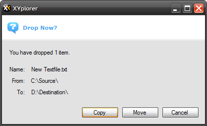
Personally I think I'd like to see the dialog eventually become:
20101103-142711 -  Screenshot.png
20101103-142711 - Screenshot.png (12.45 KiB) Viewed 1700 times
And depending on the state of Ctrl/Shift it would automatically default to the correct button, and possibly have one for Backup as well.

However, to keep consistency for the time being I'd make the buttons OK/Cancel and add a line of text to the bottom: "Would you like to move these items?" (Move/Copy, These Items/This Item)

Post Reply