- backup_progress3.PNG (69.62 KiB) Viewed 3178 times

- explorer_progress.PNG (71.17 KiB) Viewed 3178 times
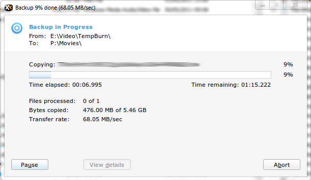
Let's not beat around the bush, the interface isn't good. Yep, I know it is a work-in-progress, hence this feedback from me.
1. The dialogue is modal. That's a no-no straight away, because there is simply no need for it to be. If I can't carry on working with other files while some are being copied then I am not going to use this functionality.
2. The visual footprint is too large. Why does it have to be so big? It's just a progress dialogue. There are excess of white (header) and grey space (bottom right quadrant) that can be trimmed down. Compare this with the progress dialogue in Explorer on Win 7. A much smaller footprint and the information is delivered succinctly. The width of XYplorer's dialogue is about 150% of Explorer's. If you shrink the dialogue's width and align items along the vertical axis (see point 9), it would make things much better.
3. Showing time to thousandth of a second is over the top. Is there any benefit to it?
4. Showing a percentage progress for individual file copying and progress bar and % for the overall progress is an inconsistent approach. I believe that showing individual file progress is unnecessary -- again, what's the benefit? -- so a progress bar showing the overall progress would suffice.
5. The positioning of the progress bar isn't good amongst the textual information. It should go to the bottom for clear separation of graphical elements.
6. Positioning of buttons is peculiar without obvious reason why each button is where it is. Pause should be next to Abort.
7. "View details" is unnecessary once backup becomes supported for background processing because details would be available through Background Jobs. Same for "View failures".
8. Captions would benefit from some love. Abort -> Cancel. Continue -> Resume. Transfer rate -> Speed. Copying -> Name.
9. Layout needs rejigging for better presentation and to eliminate wasted space. This is how it should be:
White header: "<Copying/Moving/Backing up> <number of items> (<total size of items>)
First line: Name: <name of file that is currently being copied/moved/backed up>
Second line: From: <full path of the source location>
Third line: To: <full path of the destination location>
Fourth line: Time elapsed: <time elapsed so far, with seconds the smallest unit>
Fifth line: Time remaining: <time remaining, with seconds the smallest unit>
Sixth line: Items remaining: <number of items remaining> (<size of data remaining>)
Seventh line: Speed: <speed in MB/second>
Eighth line: Overall progress bar
Ninth line: Pause/Cancel/etc buttons
Do you need to me to mock it up for you for better illustration?
10. Integration with Windows 7 progress bar for visual status of the overall progress.
Yes, it seems like a lot, but I'd rather influence the design from an early stage than battle months later.