 XYplorer Beta Club
TheQwerty wrote:I think the following text would suffice:
"Yo, you dropped some stuff.
Were you fo' real?
[Fo Sho] [Nah dawg]"
Yes, nice idea!Personally I think I'd like to see the dialog eventually become
TheQwerty wrote:I think the following text would suffice:
"Yo, you dropped some stuff.
Were you fo' real?
[Fo Sho] [Nah dawg]"
Yes, nice idea!Personally I think I'd like to see the dialog eventually become
TheQwerty wrote:Personally I think I'd like to see the dialog eventually become:And depending on the state of Ctrl/Shift it would automatically default to the correct button, and possibly have one for Backup as well.
However, to keep consistency for the time being I'd make the buttons OK/Cancel and add a line of text to the bottom: "Would you like to move these items?" (Move/Copy, These Items/This Item)
Sorry, but it still doesn't work for me anywhere near as well as TheQwerty's simple clean one with confirm choice of what to do (and thus allowing a option change, which is handy)...and which is VERY close to what one gets when you right-click DnD since you get choice of move/copy/cancel!zer0 wrote:One more try...
Just remember that my screen shot is only applicable if Don is willing to update all dialogs. And since this is non-standard to Windows I'm not actually pushing for that, though I would like to see Microsoft take some inspiration from Apple on this point for Windows 8.j_c_hallgren wrote:Sorry, but it still doesn't work for me anywhere near as well as TheQwerty's simple clean one with confirm choice of what to do (and thus allowing a option change, which is handy)...and which is VERY close to what one gets when you right-click DnD since you get choice of move/copy/cancel!zer0 wrote:One more try...
I'm not adverse to having two different types of buttons based on how/where the dialog is used as in some cases, yes/no makes more sense and in other places, ok/cancel is much better...I don't know if it's a rule that it must be one or the other but since we're trying to make it easy to use and clear to follow, that may not be possible if we restrict all buttons to one method.TheQwerty wrote:I stand by the fact that more than anything XY needs to pick a method and be consistent in its usage throughout the application.
In other words, if this dialog gets verbs for buttons everywhere else should too.
If this dialog becomes Yes/No then all confirmation dialogs should be Yes/No.
In my mind the only reason to keep OK/Cancel at the moment is it is consistent with elsewhere.
But giving me a choice to move when my DnD was to copy doesn't make much sense either. And the prompt affects LMB-dragging only so showing a prompt that is reminiscent of RMB-DnD is inconsistent.j_c_hallgren wrote:Sorry, but it still doesn't work for me anywhere near as well as TheQwerty's simple clean one with confirm choice of what to do (and thus allowing a option change, which is handy)...and which is VERY close to what one gets when you right-click DnD since you get choice of move/copy/cancel!zer0 wrote:One more try...
From my usage of Windows 7, I find such dialogues to be standard. Appropriate questions are asked, suitable choices are provided. None of this OK/Cancel monotony, which feels refreshing and human.TheQwerty wrote:...And since this is non-standard to Windows I'm not actually pushing for that...
I'm still on Vista here but I don't recall many (or any) dialogs that are using verbs on the buttons instead; have any in mind?zer0 wrote:From my usage of Windows 7, I find such dialogues to be standard. Appropriate questions are asked, suitable choices are provided. None of this OK/Cancel monotony, which feels refreshing and human.TheQwerty wrote:...And since this is non-standard to Windows I'm not actually pushing for that...
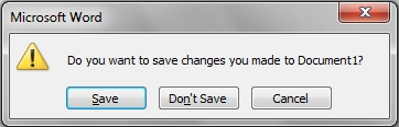
Well, since Vista/Win7 Microsoft can not be taken serious anymore as a guide in UI design. IMO. I'm playing with Win7 now for a couple of months -- a complete disaster!Pagat wrote:just to show an example that Microsoft is already using this "new" approach: Here is the save dialog of Office 2010 that pops up when you close the application:
I believe that all those who replied here would respectfully disagree given that none of us feel the current is the best...the consensus (I think) was that, as a minimum, the name should be isolated when there is only one item on a separate line and not shown when multiple items...and likely also that some extra unneeded text could be removed ("the operation" and "it now") from current.admin wrote:I rapidly read this thread and must say that the current design of the "Drop Now" box is better than all of your suggestions. IMO.
You mean "Click OK to continue, or Cancel to abort." ?j_c_hallgren wrote:I believe that all those who replied here would respectfully disagree given that none of us feel the current is the best...the consensus (I think) was that, as a minimum, the name should be isolated when there is only one item on a separate line and not shown when multiple items...and likely also that some extra unneeded text could be removed ("the operation" and "it now") from current.admin wrote:I rapidly read this thread and must say that the current design of the "Drop Now" box is better than all of your suggestions. IMO.
I hadn't mentioned this but when I dropped multiple items from WinRAR the Source: line is empty.. not sure if you can display something more meaningful, but you might want to consider removing the line completely if not.admin wrote:I changed "Source:" to "Item:" when there is only one item.
Confirmed, thanks!TheQwerty wrote:I hadn't mentioned this but when I dropped multiple items from WinRAR the Source: line is empty.. not sure if you can display something more meaningful, but you might want to consider removing the line completely if not.admin wrote:I changed "Source:" to "Item:" when there is only one item.
Yes, it's fine...that's why I suggested this as it's short and to-the-point and quite common in other dialogs.admin wrote:So this is good English?: "Click OK to continue, or Cancel to abort."