Page 1 of 8
Size Bars visual should be improved
Posted: 09 Jul 2018 14:10
by LittleBiG
Unfortunately size bar can't achieve its purpose as it is now. It is not possible to distinguish 1 Mb from 1 Gb easily.
Re: Size Bars visual should be improved
Posted: 09 Jul 2018 14:12
by admin
True.
Any idea? Maybe the whole size bars feature does not work. Maybe I just should stick to the circles?
Re: Size Bars visual should be improved
Posted: 09 Jul 2018 14:27
by LittleBiG
Actually what I wanted to see in this case is a "relative" size bar. How the file sizes maintain a relation to each other. The full bar should be next to the biggest in the folder. I didn't want to read the exact sizes by the bars.
Re: Size Bars visual should be improved
Posted: 09 Jul 2018 17:55
by admin
I have to think about this. It would be a totally different approach.
display of sizes
Posted: 21 Jul 2018 15:14
by Florian
Hello, I think, a quick visual representation of file/folder sizes can be very helpful. But I'm not sooo happy with the current implementation, see the attached file. Don't you think, is's super misleading/un-intuitive? Everybody would instantly think, the first file is largest, wouldn't he?
I mean, a more simply approach would IMO be much more visually adequate:
length of colored bar ~ size of file/folder Easy!

Of course one has to think about scaling (probably logarithmic), and how to apply colors. Maybe using colors to help differentiate between very small and very large files (instead of complicated/logarithmic/etc.) length algorithms would be most simple?
- So the length gives a visually super-fast first impression, what files/folders are largest.
- The colors help to differentia very small / medium / very large. (Or what about different colors for KB, MB, GB ?!)
- For details you always have the numeric value! Therefore IMO the length of the bar should be a very simple measure, needing no interpretation whatsoever.
What do you think? :-)
Cheers
Florian
Re: Size Bars visual should be improved
Posted: 21 Jul 2018 17:39
by Marco
I always advocated the speedometer analogy for file sizes, because the resulting icon is more compact. How to cope with values spanning across several orders of magnitude? Using more speedometer icons, or a color that conveys the magnitude.
So, for files less than 1 KB, you'd have only one icon or a, let's say, very pale blue icon, with the speedometer arm telling the size;
for files between 1 and 1023 KB, one full speedometer and another one telling the "amount" of KBs, or a single icon with a stronger blue;
and so on.
Using stronger shades of a color to tell the magnitude is not that different from the size circles feature, except that the arm of the speedometer theoretically tells an exact value (size circles don't, they have an inner circle which is not directly proportional to the size).
Using more icons is basically a logarithmic way to solve the problem.
Re: Size Bars visual should be improved
Posted: 24 Jul 2018 09:38
by Posix
How about this:
Re: Size Bars visual should be improved
Posted: 24 Jul 2018 12:02
by jupe
I don't use size bars myself so have no vested interest in this, but this would be my suggestion after interpreting what others have put forward:
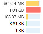
1GB+ = RED
1-999MB = YELLOW
1-999KB = GREEN
LESS 1K = PALE BLUE BACKGROUND
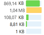
so colors based on traffic lights, and the size bars scale to the files that are currently displayed, with the largest file displayed always being a full bar, whether that is possible IDK.
So for example if your current folder only had files up to 1mb in it the displayed bars would be all green/pale blue and the biggest file shown would be a green full bar, like the red is in the below screenshot.
here is a quick mock up, (sizes aren't to exact ratios, and colors used aren't perfect)

- sizebars.png (2.18 KiB) Viewed 6504 times
And a different folders diplay, with smaller largest file:

- sizebars2.png (2.13 KiB) Viewed 6504 times
Re: display of sizes
Posted: 07 Aug 2018 10:07
by admin
Florian wrote:Hello, I think, a quick visual representation of file/folder sizes can be very helpful. But I'm not sooo happy with the current implementation, see the attached file. Don't you think, is's super misleading/un-intuitive? Everybody would instantly think, the first file is largest, wouldn't he?
I mean, a more simply approach would IMO be much more visually adequate:
length of colored bar ~ size of file/folder Easy!

Of course one has to think about scaling (probably logarithmic), and how to apply colors. Maybe using colors to help differentiate between very small and very large files (instead of complicated/logarithmic/etc.) length algorithms would be most simple?
- So the length gives a visually super-fast first impression, what files/folders are largest.
- The colors help to differentia very small / medium / very large. (Or what about different colors for KB, MB, GB ?!)
- For details you always have the numeric value! Therefore IMO the length of the bar should be a very simple measure, needing no interpretation whatsoever.
What do you think? :-)
Cheers
Florian
Well, I totally agree with this! The current way is rubbish.
OH, wow, inspiration hit me! 
A super-cool logarithmic approach would be let's call it a "Binary Bar". Each pixel is double the size of the previous: 1 2 4 8 16 32 64 ... With the current 50 pixels width of the bar it could hold a maximum of 2^50 = 1 PB (PetaByte, or more exactly Pebibyte) which is enough for current files. And it can be easily enlarged by adding pixels...
With this system I'd keep it at just one color (e.g. the same blue as the circles), else it would just be confusing. Only empty files would be totally grey (like now).
What do you think? :-)
PS:
@the others Thanks for the ideas but right now I think the combination of size and colors ultimately should be avoided because it needs too much explanation.
Re: Size Bars visual should be improved
Posted: 07 Aug 2018 12:18
by eil
from some perspective that algorithm is interesting, but that doesn't actually solve the problem.. imo since the introduction of size-bars feature lacked a relative approach = find largest item - that would be full bar, all others bars depict how less in size they are compared to the largest item in current location.
Re: Size Bars visual should be improved
Posted: 07 Aug 2018 12:45
by admin
As I said before that's a whole different thing. Needs more thought.
Re: Size Bars visual should be improved
Posted: 07 Aug 2018 13:41
by PeterH
I think your idea is just what's needed here. But I'd hope you apply a bit of scaling:
- drop some left pixels, so that the shortest bar will be just 1 (or 2) pixels long. (Else the left part of all bars wouldn't say much.)
- scale the bar, so that the longest bar will be of full size.
You will never look at a bar, then count the number of pixels, and say "this is between 16384 and 32767", but if scaled you can better decide "this is bigger than that", also for factors smaller than 2. Doesn't help much if smallest and biggest differ veryvery much - but helps if they don't.
Re: Size Bars visual should be improved
Posted: 07 Aug 2018 18:55
by admin
Well, you are right. The logarithmic bar is misleading, it makes small files look big, and big files look small.

Re: Size Bars visual should be improved
Posted: 08 Aug 2018 01:11
by eil
the problem of current approach is the same as bars of WinDirStat. i use it for searching "who's taking too much space", but that app at least has size-map, which is grate exactly for visual size compare ability.
Re: Size Bars visual should be improved
Posted: 11 Aug 2018 17:29
by admin
I thought about the problem for the last days and today I came up with something new: "Leveled Bars". Check out the next beta.
