Page 4 of 5
Re: Better visual design and visual options
Posted: 29 Jun 2013 10:48
by Filehero
Hi Don,
I can't help it but I enjoy the flat design approach MS has taken with Windows 8.

Since I still have to do some exercises with Photoline I thought about devoting those just for fun to a Win 8 style XY gui mockup. Suprisingly I've found the Styles>borders>No borders setting comes very close regarding the main gui components except the address bar.
Is it possible to make the border styles applicable to the AB (or even all components) as well?
Cheers,
Filehero
Re: Better visual design and visual options
Posted: 29 Jun 2013 10:53
by admin
Cannot say, needs testing.
But, yeah, go ahead, I always liked that flat style as well. First Windows since XP that at least visually convinces me.
Re: Better visual design and visual options
Posted: 01 Jul 2013 09:50
by raananb
Follow up on Admin post of 28 Jun 2013 14:01
Fonts become larger when system is set at 150%, but this is not the right approach, since I do not like my system set at 150%. Please adjust the fonts which currently cannot be modified to accomodate higher resolutions or let the user modify them manually.
Re: Better visual design and visual options
Posted: 01 Jul 2013 13:50
by admin
raananb wrote:Follow up on Admin post of 28 Jun 2013 14:01
Fonts become larger when system is set at 150%, but this is not the right approach, since I do not like my system set at 150%. Please adjust the fonts which currently cannot be modified to accomodate higher resolutions or let the user modify them manually.
I'm working on it. Now.

Re: Better visual design and visual options
Posted: 01 Jul 2013 13:58
by raananb
Thanks.
Re: Better visual design and visual options
Posted: 08 Jul 2013 20:07
by Filehero
admin wrote:But, yeah, go ahead, I always liked that flat style as well. First Windows since XP that at least visually convinces me.
Yesterday, I've spent some hours. However, my first
Photoline exercises rather ended up in a modest touch up of the current design instead of going towards "flat" or any other funny target.
Since I don't consider this a wish I'd like to ask where to post it. What sub forum?
Cheers,
Filehero
Re: Better visual design and visual options
Posted: 08 Jul 2013 20:10
by admin
I'd say right here in the thread, or here in the Wishes forum.
Re: Better visual design and visual options
Posted: 08 Jul 2013 21:19
by Filehero
Hi,
ok here "we" go.
Presenting the
Lightweight XY "Franken"-GUI, made of well-known parts, just driven by the "need" for quick results.
This means: except "airyness" I didn't spent much time on real usability and just followed my graphical "Spieltrieb" (
lucid drive?)!
- XY_gui_harmless.png (668.45 KiB) Viewed 2683 times
Only after finishing I realized, it also should work with 1024px of horizontal resolution.
Aunt Edith: updated attached image.
Cheers,
Filehero
PS: real heavy version in preparation, don't know when finished.
Re: Better visual design and visual options
Posted: 08 Jul 2013 22:18
by admin
Looks nice, but hard to know for me what is system (is that win8?) and what is you. Please point out what you think is revolutionary about your design.
(Off for today.)
Re: Better visual design and visual options
Posted: 08 Jul 2013 23:03
by Filehero
Hi Don,
there's nothing revolutionary about it at all! And might be good to read: nothing is dependant on the system - it's all "you", I guess.
1. Menu bar: I just took the font supposed to be _the_ standard GUI font on Win 8 ("Segoe" - though AA seems to be wrong some way) and increased the spaces between the root entries.
2. Combined tool- and address bar: First, I increased the overall padding (9px or so). Then I changed frame and background colors, so the address bar appears seemingly enclosed by the overhanging toolbar.
3. Then I "fine tuned" the list header by shameless copying Win Explorer.
admin wrote:Looks nice, but hard to know for me what is system (is that win8?) and what is you. Please point out what you think is revolutionary about your design.
(Off for today.)
Cheers,
Filehero
Re: Better visual design and visual options
Posted: 09 Jul 2013 00:54
by PeterH
Filehero wrote:Presenting the Lightweight XY "Franken"-GUI, made of well-known parts, just driven by the "need" for quick results.
This means: except "airyness" I didn't spent much time on real usability and just followed my graphical "Spieltrieb" (lucid drive?)!
Yes, graphical Spieltrieb.
But the
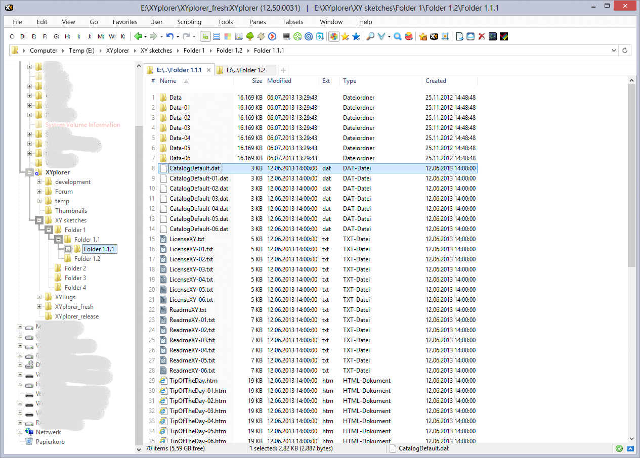
organization 

"Folder 1.1.1" is below (or inside) "Folder 1.2"
that can't be right

(Sorry, but I couldn't resist

)
Re: Better visual design and visual options
Posted: 09 Jul 2013 06:30
by Filehero
PeterH wrote: "Folder 1.1.1" is below (or inside) "Folder 1.2"
that can't be right
You're completely right, updated the folders and the image. Thanks!
Cheers,
Filehero
Re: Better visual design and visual options
Posted: 09 Jul 2013 07:23
by admin
Frankly, I don't see any big improvements. But then I don't see any big problems with the current layout.

Re: Better visual design and visual options
Posted: 09 Jul 2013 07:55
by Filehero
admin wrote:...big improvements.|
Define "big".
You're right, it's not a major overhaul. I just
- "melt" toolbar and adressbar by providing a common background colour and removing the separator
- added some padding and spacing around AB, left/right of TB and between the menu entries
- basically the same for the list pane. White background for the tab bar, the column headers and the tab "adder"; some padding between column headers and the list
- made all separators exactly 1 pixel, removed all bevel/emboss
Overall, it is a bit less 3D (aka a bit more flat) and compact. I like it, but I don't know if it's
better in terms of usability.
Cheers,
Filehero
Re: Better visual design and visual options
Posted: 09 Jul 2013 08:56
by admin
These things are very difficult because of Windows Themes. I'm sorry that I might have raised false hopes but I cannot modify theme-related interface elements because that would certainly turn out real ugly frankenstein mess for many users. (What I thought you would do was something much more radical, like a new metro kind of approach to file management, lots of colorful rectangles and so on, totally beyond the good old tree-list-addressbar scheme.)
BTW:
- A very small minority of my users uses small icons in the toolbar.
- My plans for the breadcrumb are different: there will be two of them, one for each pane.